Wednesday, 26 September 2012

Emerging Trends and Colour Stories - Summer Time

Following the watercolour colours of the spring fling palette, things get turned up a notch.  Summer time has a much more intense and vibrant story. 


sarahhearts.com

It has a vintage vibe that is pattern rich.  Bolder graphic are reminiscent of the 60's and 70's. 


eatdrinkchic

As you may have noticed chevron is the biggest pattern right now, especially in turquoise or tangerine.

spicyicecreamdesign

Think of all the brightly coloured jeans available, now translate those into home decor.  Throw pillows, some new art or other accessories will inject your space with some new life, just as adding a bright scarf or jeans to an otherwise neutral outfit. 


myfashioncents


Clear bright colours are used with a touch of whimsy.  Gotta love the punch of hot pink in this bedroom with the patterned quilt. 


blendtv
Next up is Autumn Blaze (Scarlett). 

Thanks for dropping by! 


Sunday, 23 September 2012

Emerging Trends and Colour Stories - Spring Fling


Here is Part One of the "Emerging Trends and Colour Stories" series, as promised.


harlequin.uk

At the Designer Trade Show I attend last week, guest speakers included Dixon Bartlett and Caroline Hipple, who are consultants for the home furnishings industy.  They amount of research they do is mind boggling.  Worldwide trends that even include the up and coming yarn colours in the textile industry are studied.  Attending fashion shows is another way for them to determine what the most up to date patterns and combinations are.  After compiling all the information from many different countries they come up with the colour pallet for the year. 


modsensibility


The Spring Fling colour story is comprised of beautiful watercolours.  Bright, light translucent colours that use mint green, robin's egg blue, dove grey and fushia.  Garden themes with a mix of colour and pattern - think petal power. 

citycrafter

Green will be a very prevalent hue. Many rooms were shown using different greens layered together.  All in all it is a modern restful palette that evokes that spa feeling. 

 
NorwalkFurniture.com
 

Next up will be the Summer Time colour story - check back later this week for that one! Thanks for dropping by.


Tuesday, 18 September 2012

2012 Designers Tradeshow - Emerging Trends and Colour Stories

Hello Everyone!

There is nothing like attending a designers tradeshow to get me excited about whats new in the decorating industry.


It is inspiring to be able to take in all the new fabrics and textures available.  Many of the new books shown by the fabric suppliers have just been released this week for the upcoming season. 

Five colour stories were discussed at the seminar I attended.  They are divided into colour combinations based on seasons.  There is Spring Fling, Summer Time, Autumn Blaze (Scarlett), Autumn Blaze (Copper) and Winter Wonder. 

So my next 5 blogs will be dedicated to exploring each of these colour stories in more depth. Please come back to learn all about them!

Garage Organization

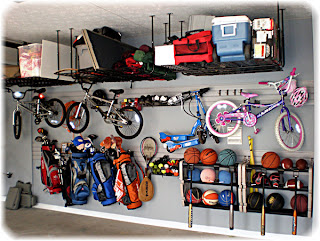
Maybe its the arrival of cooler nights, but it seems everyone feels like getting the garage in order this time of year - including me!  There are plenty of ways to keep this part of the house organized and neat. 

First of all lets address the topic of getting things off of the floor.  Garage wall systems such as the one pictured below work well, and of course cabinets are a great way to keep all that messy stuff hidden.   


amarrgaragedoors


The ceiling is also a very underused option.  If you have the room, built a loft above the garage door to store the out of season items.  If you don't have the height to make a loft, try using this simple but efficient storage idea.  Having seen this idea pictured before, it was nice to find out from a friend how well this idea really works.  Her husband ran 2 x 4's along the ceiling and slid in rough totes filled with lesser used items.  Listing the contents on the bottom of each tote gives you a quick way to determine exactly what is where.  To make these hanging totes visually "disappear" you could paint the ceiling and the wood 2 x 4's the same colour as the totes.  In her case the garage has a black back wall and ceiling, so she opted for black containers. 

ogblog.net

Another way to hide the clutter is to use lockers.  They look streamlined and are practical to store anything from tools to golf bags. 


allroomfurniture.com
 

I just wanted to mention the benefit of giving your interior garage door a makeover.  Doors that are painted white tend to show every scuff mark.   Painting the door that leads you to the interior of your home makes a nice welcoming focal point in the garage.   The dark colour on the door minimizes the look of wear and tear and keeps it looking cleaner longer. 

pinterest

I guess our habit of always preparing for the next season gets us in the organizing mode.  After cleaning out the garage you will most appreciate being able to pull the car in the first time we have a cold rainy day! 

Thanks for visiting!


Thursday, 13 September 2012

Stunning Ceilings - thinking outside the box

When we think of renovating a room, usually we imagine the type of flooring used, the colours on the walls, the window treatments and furniture.  The surface we often forget is the ceiling. 

Adding a colour besides white is one step towards creating an eye catching ceiling.  This idea looks dramatic when used in an open concept floor plan with higher than 8' ceiling. 

This is a daring choice that works well due to the balance of neutrals in the rest of the space.


blogger.com
Paint can suddenly make an otherwise blah surface interesting.  How about a painted ceiling with a pattern applied via stencil?  Other options include wood, fabric, tin tiles, ceramic tiles or cork.

homeportfolio

There is no doubt that this ceiling took many hours to create. So much cutting and fitting is involved when adding wood panels.  You would be wise to have a true craftsman install this so you get results that are straight and true. 

Have a look at the nursery pictured below. The fabric ceiling here adds such a rich look to the space.

stagetecture
 
Tin tiles can also be a welcome change.  They are very versatile product that can be used on many different surfaces. (You may remember my earlier blog about using them as a backsplash or the front of cupboard doors.)


decorpad

Ceramic tiles are a practical solution in a bathroom, due to the higher moisture content.  You could go for a subtle textured look that adds classic appeal or a bolder look with plenty of colour.

ceilingdesignphoto.blogspot

Cork has become more popular, but it is not limited to only flooring.  It can also be used on ceilings and gives a unique appearance.  Another advantage is that it muffles sound.  The photo here shows it done in a coffered ceiling with potlights.


vancouvergreenfarm.com

Ceilings that have an uncommon surface treatment are sure to be noticed and remembered.  Is there a ceiling in your home just waiting for a lift?


Tuesday, 4 September 2012

Art to beautify your world

Selecting art for your home can be a daunting task.  The main priority is finding a piece that "speaks" to you.  You will just know it when you find it.  You see a painting and your initial reaction is "that's it!" 

The trick is finding that piece that speaks to you AND compliments your decor.  Some of the variables to consider are the colours and the size.  You wouldn't want to purchase a print that is far too large for the space, then it just overwhelms.  Likewise, having the colours in your artwork clash with your existing space is not going to the art OR the room justice. 

Your selection can match with your decor and blend in for a monochromatic feel, or if you want to be more daring - add a  piece of art that injects a colour from the opposite side of the colour wheel. 

Also consider from what vantage point you will be viewing the art.  Art is often hung too high above a sofa.  Remember that you are looking at it when seated. 

The example below shows how art suits the look of the furniture in the space.  Because the bench has an open leggy look, the empty frames suit it.


stylehandler.com

It looks best when the width of the piecess are narrower than the width of the furniture it is hanging above.  I will show you what I mean:

studiobcreativejuice.com

See how the art hung above is wider than the piece of furniture below it?  To make it look more proportionate, I would suggest this arrangement instead:


The trend of hanging a group of prints together to fill a large space can really make an eye catching display.  Photos can be hung symmetrically or in a visually balanced way.  (as in the empty frames example above)
 
urbancurator
 Sometimes a better option is to hang one large stunning piece instead.  Consider the photo below.  I don't believe a set of small prints would have the same impact. 
 
doodlehome
 
 
There are so many ways to add art to your home - the best ideas are usually the simplest.  Hang art that tells people something about you.   People who enter your home get an instant sense of what is dear to you.  Treasure your kids artwork?  Have pieces framed and hung in a prominent spot.  Enjoy photography?  Have a favourite print blown up.  Love your pet?  Add a pop art canvas of him/her a la Andy Warhol. 
 
Following this suggestion will not only add interest to your space, but make you happy whenever you view it, isnt that how your home is suppossed to make you feel?