Monday, 30 April 2012

New heights for bar stools

Whether they are situated at an eat up bar in the kitchen, at a cafe height table in the dining room or a bar in the basement, many homes incorporate bar stools into their decor.

apartmenttherapy
love these stools made using truck springs -
a unique look and cool recycling idea!

I attended an information session last Friday, to familiarize myself with some of the newest available style and finishes of bar stools.  The most common chair and stool heights are of course counter height and bar height.  The newest one is called Spectator height and has a seat 34" from the floor.  Although this higher stool is used mainly in commercial applications, it is showing up more often in homes - usually at a bar in a rec room. 

The photo below shows an example of one of the stools available in spectator height. 
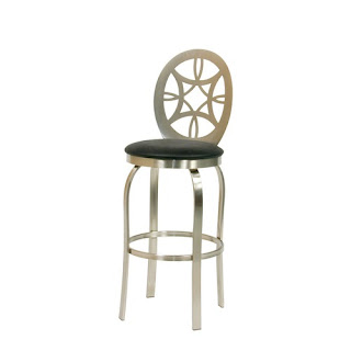

barstools.com

One of those in biggest demand is the one shown here:  people just love this look combining leather and wood.
 
barstools.com

The last two pictures showed more of a modern style, but there are plenty to choose from if you like a more classic look.  A sturdy wooden frame with rich leather upholstery is a great addition to a more traditional bar. 

ba-stores.com

One of the more popular finishes for stools is the brushed steel.  The wrought iron finish has been replaced by the brushed steel simply because the majority of kitchen appliances are stainless steel.  

If you have selected a seat with a swivel it is possible to order one with a "memory swivel."  This is a nice feature to have if you want to keep a neat, clean look at all times.  If someone turns the seat sideways to get off, it will return to its original position immediately . 

Many of the manufacturers of these stools offer a wide range of style and finishes.  Due to the vast amount of choices available you can easily order something that suits your taste and decor. 

To close I would just like to share with you a few different stools that caught my eye while writing this blog.

 
barstooldealers.com
qrbiz.com


livingroomdesignphotos.com
fridaydesign.com

I hope I have given you some new ideas to consider when renewing one of your rooms.  Introducing stylish bar stools or chairs into your decor can help give your home new life.   


Don't want to miss a post?  Become a follower and you I will keep updated!

Linda

linda@changesinteriordesign.ca

Tuesday, 24 April 2012

Anchoring a room with an area rug

Wood flooring is pretty well the standard in most homes these days.  In order to make the space feel more "lived in" and reduce noise, many of us opt to add an area rug.  Area rugs are a great way to inject some style into a room, as well as visually seperating different areas in an open concept floor plan.

captivatist

When I last visited the Interior Design Show in Toronto, I was so taken in by the gorgeous rugs available.  Traditional rugs were represented there, but the new modern and transitional patterns were what really caught my eye. 
Modern Weave had a fantastic display of unique area rugs.  There were enough choices to suit every taste.  Talking to one of the reps I found out that creating custom rugs is something they will gladly do.  He told me one family had their daughter's finger painting transformed into a stunning piece of art.  That would certainly make a great conversation piece!  Here is an example of another rug that would be talked about for a long time after visitng. 

thisnext.com

Recently I have been asked about guidelines regarding the size and placement when choosing an area rug.  Lets start with the sizing.  No one wants to completely cover up the look of beautiful hardwood floors, but you dont want the rug to look like its far too small for the sitting area.

A popular guideline is that the front legs of a sofa or chair should sit on the area rug, and the back legs off.  

younghouselove

The sitting area is completely unified by the area rug, and creates an inviting oasis to gather with friends and family.  The 18" dark wood perimeter highlights this space even more due to the high contrast between the rug and floor colour.  The general rule regarding area rugs is to have 12-18" of wood surrounding the rug. 

Of course that is not a hard and fast rule.  Some like to place all legs of the furniture on the rug, instead of only the front.  The end result here is also a cohesive space and works very well.


modernrugs


This principle also works best in dining rooms as illustrated here:


cthomesllc

   
I have also seen rugs that sit in the center of a grouping of furniture.  Personally I feel that makes it look like it is too small for the space.  Have a look at this example: 

homeworkshop

Area rugs in bedrooms with hardwood flooring are placed a little differently.  To make the area look pulled together, it is best to place the rug in this manner. 


jakabare.com
There are so many unique area rugs on the market now.  I just had to share one of my favourites.  Image this placed in a games room or den - it would instantly give an ambiance of playfulness. 


 An area rug can be the inspiration for the look of an entire room -  for example the one I purchased for Ashten's room.  It became the starting point for the style and colours of her room makeover.  If you require some assistance with renewing a room in your home visit my website at changesinteriordesign.ca


Thanks for dropping by!

Monday, 16 April 2012

Tin tiles - not just for ceilings anymore......

Tin ceilings in old homes are such a beautiful architectural feature it's no wonder many people try to replicate that look. Faux panels made to look like the intricate detail of tin tiles can be purchased at different building centers in an abundance of patterns.   Installing them on the ceiling give it brand new appeal and interest.  Colours vary from the shiny silver to a bronze or an aged white.

decorpad.com

These faux tin panels look best when used in a coffered ceiling, or finished with crown moulding around the perimeter. 


While I appreciate this timeless look I also enjoy mixing classic features into a space in an unexpected way. Manufacturers of these products have come up with more contemporary line, so now it fits in with the traditional to transitional and modern.

fasadepanels.com

As of late, tin tiles have gained popularity as a backsplash as well.

avenuehomesteader
There are other ways to use them in the kitchen such as covering the front of the dishwasher, or using them as an inset on cupboard doors.   Both of these ideas look especially fitting in a vintage or country style kitchen.                                                                                                         


saraplus2
They can be also be used on a feature wall whether you want a dramatic look or a subtle one.   Have a look at the following pictures to illustrate what I mean.


Used on a sit up bar, as a fireplace surround or headboard are other applications I came across.   


hammersandhighheels

As you can see these panels are extremely versatile.  Cornices, borders and dado panels are also available to achieve a seamless look.  Whether you desire an ornate and formal treatment or a streamlined and contemporary one, these faux tin panels can be a great way to add a custom look to your home. 

While searching for some inspirational photos, I came across one I found absolutely stunning.  I just have to share it with you.  The ceiling here adds that hint of glamour while reflecting the light.  To me it has the feeling of a fancy ballroom.  Having a dinner party in this room would no doubt feel like an event! 


Thanks for stopping by!

Need to add some new life to your home?  I'm here to answer your questions, give ideas or set you up with a plan to transform the look of your rooms. 


Want to know more?  Visit me at  changesinteriordesign.ca

Wednesday, 11 April 2012

Spring Cleaning and Storage Ideas

Springtime sees everyone giving their homes the once over.  Getting rid of the old and in with the new.  (Or possibly giving old items a new place to be enjoyed and cherished)  I saw this display at the Canadian Table and Giftware Association (CGTA) earlier this year and thought it really evoked the feeling of spring.  (I just may want to add this arrangement to my family room after all my spring cleaning is complete.....) 

Spring Accessories at the CGTA
I actually look forward to sorting through my items room by room.  I look at each item and decide if I will use it, display it or toss it.  There is something liberating about discarding all the items I never use or look at anymore.  I love the feeling of  having a clean and organised space where you can find the things you need when you need them.   

After purging each room we may decide to give it a little lift after achieving that calm and organised space.  Since storage space is at a premium, I am always on the lookout for ideas that utilise dead space or do double duty, while staying ascetically pleasing. 

The following are some examples of storage ideas that you may be able to implement in your own home.
  
The kitchen truly is the heart of the home - and this is also evident when you see how many items that don't belong somehow end up here!  In addition to the obvious many of us keep cleaners, garbage bags and the like under the sink or on the counter.  I saw this idea for those of us who really like to keep things accessible and out of site. 

apartmenttherapy.com

Newspapers, school trip forms and mail usually end up sitting on the counter.  The solution in our home was a shoe cabinet from Ikea.   It is a shallow cabinet with 3 slim drawers.  The top drawer holds the days paper and our current mail.  The 2 lower drawers are used for our daughters.  They each have their own place to keep their homework, school forms and extracurricular information, and it keeps the clutter off the counter!    


If space doesn't allow for another cabinet, the inside of your cupboard doors can serve as some much needed storage.  Installing a pegboard to the inside of the door allows you to hang up all sorts of small items.  The chalkboard is another idea, and the best part about this is that everything stays hidden and therefore, neat. 

iheartorganizing.com

Entryways are another place where things tend to collect.  Have a bowl or decorative box at the front so you have  somewhere to put keys, gloves etc.  The foyer will look a lot cleaner just having the items all in one container instead of  strewn throughout the area.

homelife.com.au

Many entry's don't have enough space to hold everything we need.  If this is your situation it may be worth adding much needed storage in another area.  If your stairs have dead space underneath, here is a practical solution that also looks great.

shelterness.com
 Another idea involving stairs is adding a drawer hidden behind the riser.  I love the idea of reclaiming space that is otherwise unusable. 

design-decor-staging,com
There are plenty of other stylish storage solutions out there,  one that can help solve your particular dilemma.  Remember that having an organised home means different things to different people.  The key is finding a way to make it work for your lifestyle and suit your taste.  

If you require assistance with giving your rooms a lift please email me at linda@changesinteriordesign.ca

Sunday, 1 April 2012

Colours and Accessories for 2012

Many of you are already know  that Tangerine Tango is THE colour of 2012.   I was made aware of this while visiting the furniture show earlier this year.  

I am sure that more than a few of us are thinking "ORANGE?"   A repeat of the 70's?  Fortunately no!  This vibrant colour is to be used as a bold shot of colour in the form of  accent pieces. 

apartmentsilike

Personally I find an entire room painted orange a bit much, you may agree with me on this.  It is a very stimulating colour and used in large amounts may be overwhelming.  Using it as an accent colour however, can be stunning.

If you want to stay with the current trends, here are some ideas on how to inject a bit of this latest hue into your home decor without spending a huge amount of money.  Surprizingly tangerine looks fabulous in combination with more colours than you would think! 

eclecticrevisited

It is a nice contrast with Navy, Chocolate, Black, White or Cream and works well with many neutrals.  This photo illustrates how the new orange accent pieces can successfully be added to an existing room.  A good rule to follow is to repeat the colour a few times in the same space so it looks intentional.  Imagine placing one new accent pillow on a couch, the end result would end up looking like a mistake.   

Tangerine can evoke a sense of warmth in a room when combined with red and yellow - think of an analogous colours scheme similiar to those in a sunrise.   

insidecolumbia.net


It will be an unexpected shot of colour when combined with greens and blues.  The next photo is a great example of how sophisticated it can look when mixed with green tones. 


kriciapalmerhome


Orange looks classic and elegant with grey.  The headboard, wall treatment, accent pillow, throw and candle are all that have been done in the new colour.   Compare the cost of those items to that of purchasing new case goods such as a dresser or sofa. 


canyonstone


Even in childrens rooms it is appropriate - think pink and orange as a eye popping combination for a girls room - or a construction theme using neutrals and orange for boys.

If you currently have a lot of soft neutrals, it is easy to combine with tangerine.  Your eyes will be drawn around the room with the punch of the new colour.  Same goes for a mostly white room - you will be rewarded with a fresh and cheerful feeling space.   


housetohome.co.uk

I hope I have inspired you to consider including a bit of tangerine tango into your home.  If you have any questions regarding how to incorporate orange accessories, please send me an email, in the meantime, have fun with it!

linda@changesinteriordesign.ca


On a side note, I am pleased to announce that my website is now complete!  Click on the link below to have a look. 

www.changesinteriordesign.ca